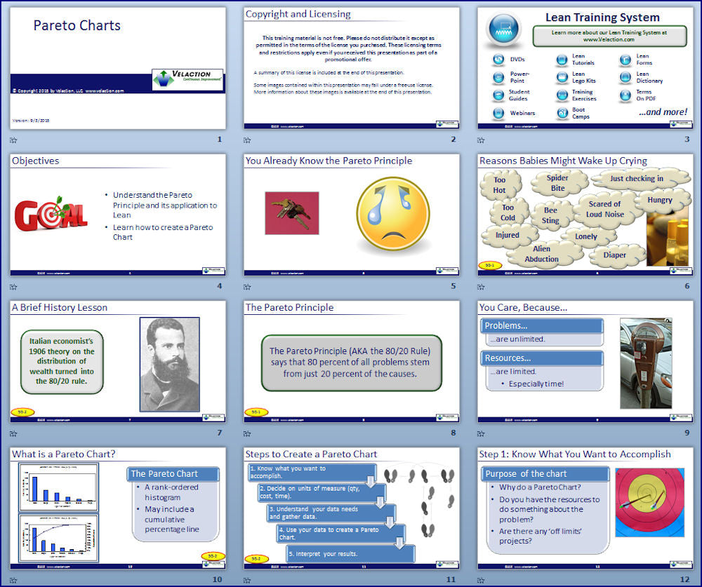
Pareto charts are one of the simplest problem solving tools. Because they are easily understandable and can be quickly created in Excel, they are a widely used. Pareto charts simply rank order "buckets" of data points by the selected criteria, and let people see visually how the minority of problem types cause the majority of incidents. This understanding helps people focus their resources where they will get the biggest impact.
Because of its highly visual nature, the Pareto Chart is an outstanding visual problem solving tool. Not only does it help point teams in the right direction, but it also helps problem solving teams communicate to others what they will be working on, and why. Very few charts are as quickly and as easily understood as the Pareto Chart.
This short module addresses what the Pareto principle is, how to use it to solve problems, and how to avoid common problems. It also includes tips on how to make outstanding Pareto charts and how to put them to use making improvements in your company.
View the full course curriculum and additional information at CI Central.
You will receive an email with a link to download your digital product. This link will expire after 3 downloads.
This products contained in this download pack come with corporate licenses which allow you to share the product within your company only.
The licenses are automatically assigned to the company name used in the purchase of the product, or if no company included in the purchase, to the company email used in the transaction. If a personal email is used, the license must be manually assigned.
The license is permanent and non-transferable. It is valid only for single reporting units of companies under 20,000 people. For example, that means that a holding company would need licenses for each company in its portfolio.


