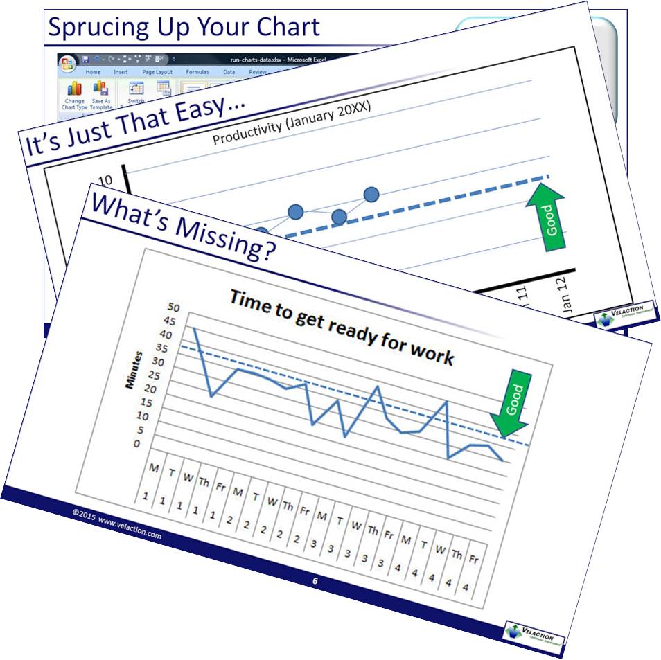
Run charts are a great way to track changes in a process or metrics over time. The horizontal axis shows time. The vertical axis shows the metric under observation.
They are extremely useful because run charts are simple to set up, and are easily understandable by most people.
This short module explains what a run chart is, why it is useful, when to use it, and how to make one. It shows how to make a run chart manually, as well as in Microsoft Excel.
This training module is part of our Lean Training System and is based on a narrated PowerPoint presentation.
It is one of 36 modules from this early training content we provided.
Training modules are at Continuous Improvement Central, Velaction's training and resource platform. Upon purchase, this product will be added to your existing account (based on your email address), or a new account will be created if you don't yet have one.


